
Video content engagement tools.
Global Fortune 500 broadcaster
Our global Fortune 500 client is a leading broadcaster, pay TV operator, and India's first premium OTT, video-on-demand (VOD) service. India is a highly competitive environment with more than 30 OTT and VOD platforms. It simplified processes and enhanced daily experiences. It enabled better coordination across roles.
Our global Fortune 500 client is a leading broadcaster, pay TV operator, and India's first premium OTT, video-on-demand (VOD) service. India is a highly competitive environment with more than 30 OTT and VOD platforms. Our client made extensive investments producing popular original content and celebrity-led shows. Wanting to create more engaging experiences for fans of these shows, they chose Ascendum to develop a variety of scalable integrations and interactive elements. They wanted contests, games, surveys, etc., to be played in parallel on second screens (mobile devices) while viewing the live streaming content.‚®‚®They asked us to develop a proprietary CMS interaction platform that would create stunning fan engagements on apps. Not just for entertainment and reality shows, but also for live audiences inside stadiums and event centers hosting sports and music events. The solution needed to allow for monetizing.
Ascendum was selected to develop a proprietary Experience Management System (EMS) to integrate a library of interactive services and fan-engagement products. These included live polls, voting, quizzes, sentiment/mood emoji meters, video walls, photo walls, and predictor/viewer suggestions. By connecting these fan engagement apps with gamification‚îleaderboard and gratification (sponsor prizes, vouchers/coupons) strategies‚î the client is able to increase traffic to events. The EMS system also delivers scalable API support to enable seamless and trusted player engagement. Our team also provided market segmentation analytics to visually display interactive viewer segments and winner graphics while the TV shows are streaming live‚îhelping to engage the sponsors.
In a multi-year engagement that is currently active, Ascendum's team has delivered a publishing platform that connects second screen fan actions to live show sequencing on first screen (TV) through live operator and analytics dashboards. The EMS system also supports multiple languages across second screen engagement products and is designed for ultra-high performance.

A friend meetup app.
Rownd Up
A start-up based in San Francisco needed help to bring their app idea to life. Their mission was to reinvent how people arrange to meetup with their friends. This resulted in smoother and more effective workflows. The solution introduced a new level of operational clarity. Team coordination was noticeably faster.
A start-up based in San Francisco needed help to bring their app idea to life. Their mission was to reinvent how people arrange to meetup with their friends. The brand and app UI needed to reflect the location-based nature of the business, whilst also capturing the feel good, fun experience of meeting with friends. Additionally, the app had to be intuitive, providing the ability to arrange a meetup in seconds, yet also accommodating multiple offerings and tailored experiences.
Designing this app we focused on creating a visually engaging onboarding process and a sleek user experience for effortless meetup organization. We crafted unique designs for category icons to inspire distinct visual identity, with each icon contributes to the app's overall appeal and user experience.
The app is centered on simplifying meetup creation with a straightforward process that guides users through minimal steps and tracks progress in real-time. We've improved user interaction by offering clear response options (yes, no, or maybe) for invitees. The client's appreciation for our unique illustrations highlights the creativity and satisfaction we brought to the design process.
The end result showcases a new and unique visual design, presenting a cohesive and distinct identity.
A sleek user experience was our top priority in designing the app, ensuring a seamless process for organizing meetups with friends.
We infused the app with unique, hand-drawn illustrations to give each category its own personality and visual appeal.

Retail automation branding.
A global footwear company
The Curio design team was tasked with crafting a brand identity for a global footwear companies automation integration team, operating within an industry typically lacking visual excitement. The brief was simply to convey the team's excellence and grant them a distinctive voice in their daily accomplishments.
The Curio design team was tasked with crafting a brand identity for a global footwear companies automation integration team, operating within an industry typically lacking visual excitement.
The brief was simply to convey the team's excellence and grant them a distinctive voice in their daily accomplishments and for an event that they were attending. From a brand perspective we took this to mean "make us stand out." To revolutionize the approach, we embarked on the initial challenge of naming.
This creative liberty led to extensive brainstorming, yielding over 100 potential names. A strong name is pivotal in shaping creative execution. It wasn't until we scrutinized the team's abbreviation and functions that we struck gold...
FLAIR is an abbreviation of the companies automation integration team but re-imagined‚ô This expressive name opened a very clear path to how we would approach the design.
We took inspiration from bold, clean and ostentatious design supported by intentionally crafted statements that carry a specific bold tone of voice. We made sure that the brand was about championing the teams talent and daily achievements and ensuring everyone was represented equally.
We wanted to create a winning team culture and one they would be attractive t work with and for and a design that would work over touch points:
Over 100 names generated around varying themes. A phase of this was presented back along with favourite.
A bold typographic logo supported by visually bold colors, modern team imagery and motion design.
A celebratory and bold tone of voice that champions teams.
Guarding the brand application to ensure a consistentand correct application of all the created assets.
The FLAIR brand identity was very well received by the team upon its application to specific touch points. The logo crafted typography with an exclamation mark containing a spark of creative flair.
Intentionally designed to be modern, bold and work in one colour. The spark can also be a team members favourite color expression. The design was referenced as being a stand out branding project for the year and despite a short time frame, the design process yielded impressive and unexpected results.
We're pleased to have provided the teams with a platform to communicate their skills within a specialist and complex tech environment.
This applied to:
Extensive branded Figma templates that can be used to present at events, clients and internal teams.
Production of specific materials for team events.This included t-shirts, wrist bands and banners.
Posters around events and the office which highlight team achievements and ethos.
Supplying assets for items such as email signatures where teams can choose their own FLA!R color.
A Camaro owner community.
REV! Redline
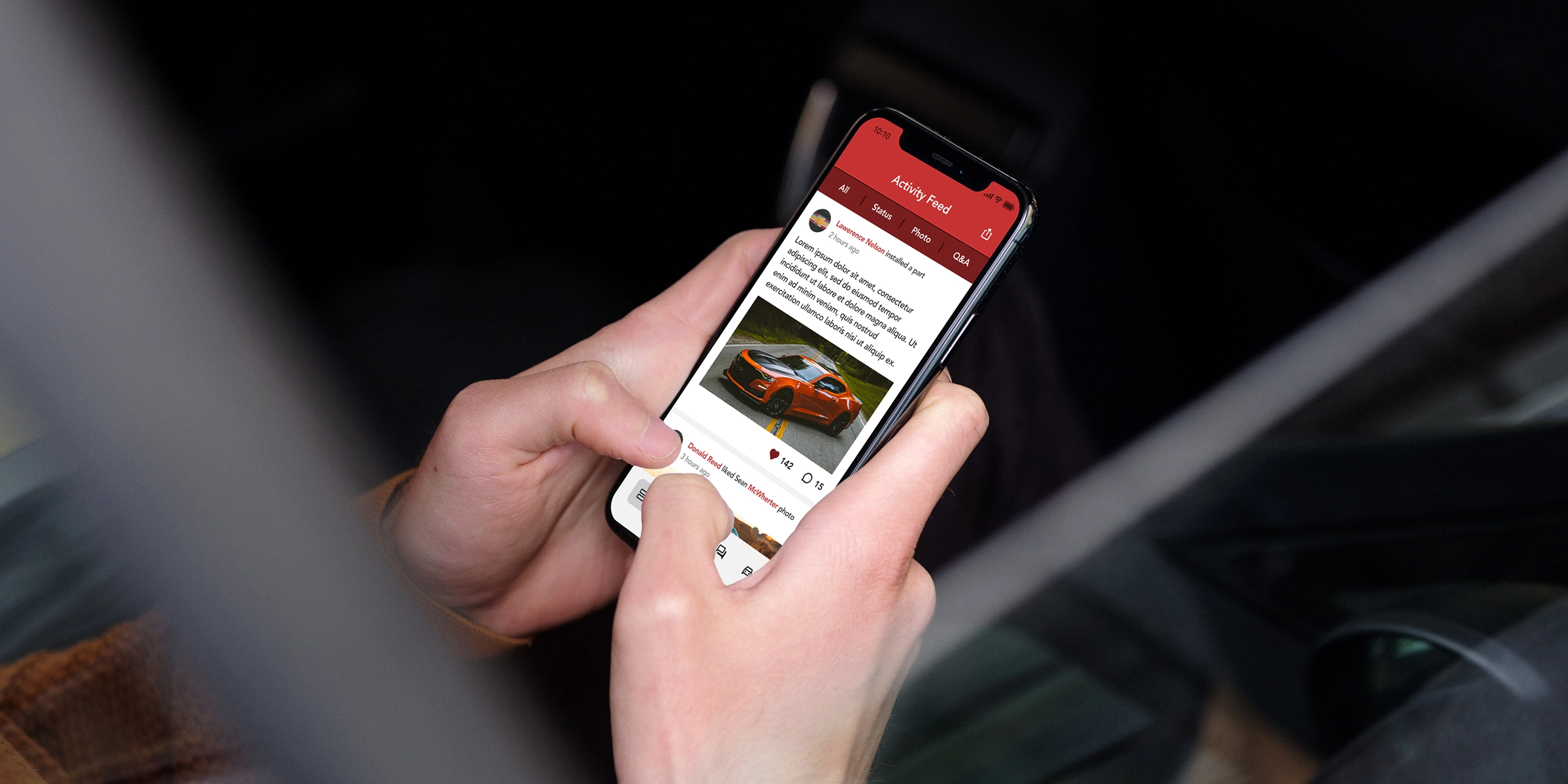
The client set out to build a bold, community-driven app designed specifically for Chevrolet Camaro enthusiasts.
The vision was a platform where users could connect, share custom mods, troubleshoot issues, and showcase car upgrades. The app needed to be visually distinct, easy to navigate, and capable of letting users add or remove parts or modifications to their vehicles seamlessly.
We focused on creating a user experience that was simple and intuitive, with the community and social sharing at its core. That’s why we designed the feed as the home screen—allowing users to instantly like, comment on, and share posts from other Camaro owners. To give the app its own visual identity, we proposed a bold vermilion red theme paired with clean, contrasting UI elements. To push it further and make the app unmistakably unique, we designed a custom app icon and splash screen that captured the high-performance spirit of the Camaro.
The vibrant vermilion red established a strong, memorable brand presence. For content-heavy views, we introduced a striped UI layout to enhance contrast and readability. The standout feature was the custom icon—a bold graphic inspired by a vented hood of a bright red Camaro, echoed on the splash screen as well. In a time when skeuomorphic design and eye-candy interfaces dominated the App Store, this distinctive visual style helped the app cut through the noise and grab attention.

A B2B procurement platform.
ShakeDeal
Shake Deal, Indias leading B2B e-commerce and supply chain tech company, transforms enterprise commerce and procurement through proprietary platforms and Ops-Tech infrastructure. The task involved a complete rebrand of their materials and messaging to align with an AI-driven approach, creating a flexible style that could.
ShakeDeal, India's leading B2B e-commerce and supply chain tech company, transforms enterprise commerce and procurement through proprietary platforms and Ops-Tech infrastructure. Top companies rely on ShakeDeal to streamline P2P cycles, optimize spend, and enhance supply chain visibility and transparency. The task involved a complete rebrand of their materials and messaging to align with an AI-driven approach, creating a flexible style that could adapt across various areas. The goal was to modernize the branding to support this direction while ensuring adaptability across departments or business units.
We crafted a compelling visual USP for ShakeDeal, centered on communicating connection and unity. By leveraging the brand‚ôs name and core services, we developed a fresh identity that honors its legacy while embracing a modernized and interchangeable approach. The new identity seamlessly references the company's original brand while emphasizing its evolved offerings in Supply Chain Solutions, Software, Strategy, and Service. This updated identity is both adaptable and memorable, reflecting ShakeDeal's unwavering commitment to driving value through innovation and customer-focused solutions.
A bold logo that communicates connection, links, handshake, and collaboration, supported by a contemporary, premium color palette, modern team imagery, and sleek illustrations.
A direct tone of voice that confidently champions the product, highlighting its strengths and value without unnecessary extras.
Ensuring consistent and accurate application of allcreated assets to safeguard the integrity of the brandacross every touchpoint
The updated brand identity captures the essence of ShakeDeal with a distinctive new icon and a modern, stylized wordmark. Together, they highlight ShakeDeal's role as a premier online B2B marketplace. The use of clean, simple shapes in a refined corporatecolor palette conveys professionalism and efficiency, reflecting ShakeDeal's commitment to trust and quality assurance. Incorporating the handshake connection symbol as a prominent graphic element in the logo, it communicates clarity, reliability, and modernity, resonating with clients and customers seeking a professional and efficient ecommerce marketplace.
Comprehensive branded templates designed for seamless presentations at events, for clients, and internal teams, ensuring a consistent and professional brand experience.
Produced customized materials for team events,including t-shirts, wristbands, and banners, to promotebrand unity and enhance team engagement.
We revamped our event strategy to command attention in a crowded visual landscape, pairing it with a selection of promotional items that reflect our sleek, premium aesthetic. In addition, we developed versatile templates for social platforms to ensure consistent, high-quality brand communication across all channels.
We supplied assets for various items such as emailsignatures, office materials, t-shirts, notebooks, mugs,and banners, ensuring a cohesive and professional brand presence across all touchpoints.

A peer-to-peer rental app.
Shneebs
Shneebs is a Facebook-based tool for community lending and borrowing. Users can advertise items they want to lend or request to borrow from their network. Shneebs connects borrowers with lenders and helps manage the loan process, including tracking, reminders, and return enforcement.
Shneebs is a Facebook-based tool for community lending and borrowing. Users can advertise items they want to lend or request to borrow from their network. Shneebs connects borrowers with lenders and helps manage the loan process, including tracking, reminders, and return enforcement. The platform aims to expand users reach beyond their social circles and will generate revenue through monetizing item advertisements. Future plans include commercial opportunities for equipment rental businesses. Central to the platform is a matching and control system, supported by user scoring, to ensure reliability in transactions.
Shneebs will integrate with Facebook as a full-featured app, with an extended ecosystem that promotes the platform through referrals, listings, and off-Facebook engagement to drive traffic and raise awareness.
Platform growth through SEO and off-site marketing, built-in app features for user referrals, and social referrals generated naturally when users lend goods to friends, with notifications prompting engagement and platform adoption.
Revenue is generated through paid item listings and advertising opportunities for hire companies and community organizations.
Gamification will motivate users with achievement points, enabling them to earn badges and rewards like Facebook credits for milestones and referrals.
We focus on developing a straightforward platform for community lending and borrowing by implementing a free loan book for tracking items and a paid system for listing goods. Our priority is to create a user-friendly experience, incorporating gamification elements like achievement points and badges to drive engagement. We emphasize transparency and trust through user ratings, allowing feedback without impacting rewards. This approach ensures a practical, effective solution for fostering a collaborative community.
We delivered a practical platform with a bespoke and unique design inspired by the comic book chat bubble. Blending nostalgia with modern flair, it offers a timeless, memorable look. The platform made community lending and borrowing easy and engaging with users tracking lent items effortlessly and listed goods for rent with minimal hassle. Streamlined process makes publishing item for rent, swap or giveaway quick and hassle-free.

A second-screen engagement feature.
A video chat and messaging app company
A video chat and messaging app company needed a partner to help them build a simple and beautiful video platform to rival all others in the market. They were looking to develop a mobile platform that would offer quality HD video and audio calls with up to 12 participants and desktop sharing.
The company needed a partner to help them build a simple and beautiful video platform to rival all others in the market. They were looking to develop a mobile platform that would offer quality HD video and audio calls with up to 12 participants and desktop sharing. Their team engaged Ascendum for our full-stack custom software capabilities coupled with our expertise with live streaming technologies. Our team quickly created a comprehensive development strategy and delivered a video conferencing app the likes of FaceTime and Skype. The business became popular and our team re-imagined it as a social sharing platform four years later.
Our teams developed trivia games and an Emoji Drawer feature to support second screen interactions powering a major live streaming sports event in India.Our teams were part of the OTT app development on the Apple TV platform and deployed second screen interactions in iOS and Android mobile/tablet apps ahead of the 2018 edition of the game series. In the trivia game, for every answer correctly provided, there were prizes or offers from sponsors. The app also monitored ad injections, app viewership, and integrated with payment wallets.

A music merchandise app.
Studio 713
713 Media Group, Houston, a premier full-service studio with more platinum records than any other in the city, wanted to create an app called Flux TV, a hybrid platform that functioned as both a media viewer and a merch store. The approach increased engagement across teams. Overall it led to a more streamlined process.
713 Media Group, Houston‚ a premier full-service studio with more platinum records than any other in the city, wanted to create an app called Flux TV‚ a hybrid platform that functioned as both a media viewer and a merch store. The content would come directly from Studio 713‚ production catalog. Initially designed for iPad and later adapted into a native iPhone experience, the app needed to feel unique in both look and navigation, with simplicity as the guiding principle.
We leaned into minimalism from the start. Since the app centered around video playback, the interface needed to stay out of the way‚ neutral and distraction-free. To achieve this, we used a pure black background paired with clean white text and call-to-actions, ensuring maximum contrast and a cinematic feel. Navigation was intentionally simple: inspired by the experience of flipping through old-school TV channels, users could easily move forward or backward through content. To support this, we introduced a brief startup gesture tutorial that taught users how to navigate the app effortlessly, keeping the experience intuitive and frictionless.
Airplay was a new feature, and we emphasised its streaming capability, allowing users to easily stream content to external devices.
Merchandise was integrated naturally into the UI, designed to feel like part of the app rather than a traditional ad.
The app successfully showcased Airplay functionality, with users easily streaming content to external devices, enhancing their viewing experience. The merch integration was seamless, designed to feel like a natural part of the app rather than an intrusive ad. The simple navigation proved intuitive: swiping left and right to browse videos, up and down for options and the store, and tapping to mark favourites made the app feel effortless to use. Overall the minimalistic approach helped keep the user experience clean and focused, while maintaining the app‚ identity and core functionality.

Smart vending machine technology.
Vending market leader
Addressing the challenges faced by the global leader in vending commerce, Ascendum focused on revitalizing the software testing team. The client, known for its innovative Bezel technology for payment processing in vending machines and a suite of operational management products, was encountering delays in product launches.
Addressing the challenges faced by the global leader in vending commerce, Ascendum focused on revitalizing the software testing team. The client, known for its innovative Bezel technology for payment processing in vending machines and a suite of operational management products, was encountering delays in product launches due to prolonged regression testing cycles. Ascendum took on the task of optimizing the testing processes to overcome bottlenecks, enhance efficiency, and ensure timely releases. The goal was to streamline testing operations, reduce cycle times, and contribute to a more agile and responsive testing environment for the client's vending machine software products.
Over the past seven years, Ascendum has solidified its role as a trusted product-testing partner for the client, establishing an end-to-end testing capability. This comprehensive testing approach encompasses unit, functional, and regression testing, ensuring thorough evaluation of the client's products. The testing suite has evolved with the integration of automation, enhancing efficiency and coverage. Notably, Ascendum has extended its testing services to encompass new product lines, demonstrating ongoing collaboration and adaptability to meet the evolving needs of the client's business.
By implementing quality assurance optimization and automation solutions, Ascendum played a pivotal role in enhancing the client's QA processes. This strategic approach led to significant improvements, enabling the vending payment giant to bring high-quality products to market at an accelerated pace. Ascendum's ongoing commitment to delivering pioneering QA solutions underscores its dedication to maintaining product quality and fostering consumer confidence for its client.

A brand identity redesign.
Ascendum
In 2024, our brand teams set out on a mission to transition from a departmental structure to a unified team, known as 'One Ascendum', leveraging the diverse talents scattered across our organization to form one cohesive and exceptionally talented team. Navigation times dropped significantly.
In 2019, Ascendum embarked on a successful rebranding journey, introducing our 'Develop Beyond' ethos and a distinctive visual identity tailored to each department's uniqueness.
In 2024, our brand teams set out on a mission to transition from a departmental structure to a unified team, known as 'One Ascendum', leveraging the diverse talents scattered across our organization to form one cohesive and exceptionally talented team.
We needed to reignite the spirit of 'Develop Beyond',which had somewhat waned over time. Furthermore,this presented an ideal opportunity to infuse the'Develop Beyond' ethos into all our company assets, revitalizing our brand essence across the board.
We focused on driving the Develop Beyond message, infusing it with purpose, and streamlining the branding to reduce clutter. Develop Beyond celebrates people, collaborations, small victories, and meaningful moments. To effectively convey this, we adopted a more concise and engaging copywriting approach for leading statements and messaging. Our goal was to incorporate a progressive statement that can culminate with Develop Beyond the visual identity was designed to be clean and premium, featuring a minimalistic aesthetic that can adapt easily to various contexts.
We crafted a dynamic vision for the presentation of 'Develop Beyond,' marked by creativity that knows no bounds. Usually beginning with 'Today,' each iteration unfolds with a concise statement highlighting our accomplishments or forthcoming triumphs, allowing us to infuse creativity to everything.
We devised a sleek new visual identity system, seamlessly blending the branding into black or white to symbolize unity under 'one ascendum,' transcending departmental distinctions. The visual identity, characterized by its cleanliness and simplicity, serves as an ideal canvas for our copy-driven concept to flourish.
Throughout the process, we maintained constant communication and collaboration with teams and stakeholders, prioritizing their input to ensure that their voices resonated in the new approach. Our commitment to inclusivity made the transition to 'one ascendum' a truly collaborative endeavor, fostering a sense of belonging among all involved parties.
A rebrand represents a comprehensive undertaking, touching numerous aspects of the company.
With the introduction of the new branding, the very essence of 'Develop Beyond' has undergone a profound transformation, now serving as the guiding principle infusing meaning into every facet of our operations, while empowering every individual at Ascendum to showcase their advancements.The adoption of the 'one ascendum' approach has fostered a greater sense of unity among our team members, facilitating the exchange of expertise and knowledge in an environment characterized by inclusivity and a broadened perspective.
This collective ethos allows us to learn from one another, thereby enriching our collective journey towards progress.
Our brand team has proactively implemented Brand Guardianship across all digital and print assets, seamlessly integrating them into our daily operations. With the introduction of a refreshed logo and lockup, as well as a Digital Business Card App and Email signature product, teams can effortlessly produce assets while upholding brand consistency. Furthermore, we've revitalized our social pages to reflect unity and developed new templates to support our initiatives.
Client presentations serve as the visual embodiment of our identity to our clients, making it imperative that they were redesigned based on feedback to enable our teams to swiftly turnaround presentations.
We revamped our event approach to command attention amidst a busy visual arena, complementing it witha selection of promotional items that exude our sleek, premium aesthetic.
Our brand team took on the task of building our website, marking a significant milestone for us as it allowed for the seamless integration of design and development processes.

A facility services marketplace.
Retail facilities management provider
The largest marketplace for facility management services in North America embraced a razor-sharp focus on "business powered by technology. "The global firm needed a proof of concept for a new enterprise data warehouse infrastructure and analytics. It simplified processes and enhanced daily experiences.
The largest marketplace for facility management services in North America embraced a razor-sharp focus on "business powered by technology. "The global firm needed a proof of concept for a new enterprise data warehouse infrastructure and analytics. The POC initiative included in-depth requirements and complex design projects. The project was the flagship initiative for their new chief technology officer.
We performed an in-depth discovery phase and used our global team to deliver a sophisticated POC which included:
Our global team of data engineers and designers collaborated to quickly deliver next-generation data analytics and reporting tools.We aggregated, collated, and visualized large data pools to provide enhanced enterprise management and best-practice controls for both data and access.

Scaling capacity through bookkeeping.
Manhattan Bookkeepers, Inc.
A Manhattan accounting firm specializing in bookkeeping, payroll, and CFO-level services was struggling with high overhead costs, capacity gaps during peak periods, and no clear visibility into team productivity.
Our client, a large accounting firm based in Manhattan, specializes in bookkeeping, payroll, and CFO-level services. The firm was challenged with high overhead costs associated with maintaining onshore staff in New York. They also faced capacity constraints during month-end close and peak tax season, delays in task completion due to increased client demand, and a lack of standardized process and real-time productivity visibility.
Established a dedicated 1 offshore senior accountant and team aligned with the client’s systems and workflows.
Implemented a process-driven operating model with defined SOPs and daily productivity tracking.
Set clear service-level expectations for accuracy and turnaround times.
Performed ongoing quality reviews and performance monitoring.
Delivered an estimated 40% cost savings through a single offshore resource, while maintaining service quality and turnaround times.
Enabled savings of 25–30 hours per week for the onshore team.
Reduced review corrections by 35% within the first three months.
Enabled the firm to support a 15% increase in client workload without adding onshore headcount.

A child health monitoring app.
Magic Fountain
Client had an issue with current website when it comes to digesting the content and navigating specifically around disorders section. It simplified processes and enhanced daily experiences. It provided better oversight across the entire platform. This improved usability for all users.
Client had an issue with current website when it comes to digesting the content and navigating specifically around disorders section. Biggest problem their users experienced was to quickly find critical information, especially in emergency situations concerning their child's disorder. The design feels cluttered and overwhelming, leaving userslost when they need help, so the goal of the redesign is to simplify the design, making it easier to find importantresources fast.
We focus on enhancing existing branding while ensuring easy access to crucial resources. An emergency page, complete with specialist contact information, need to be accessible from anywhere, so the CTA need to be placed in the navigation. Additionally, the site should have a better support through AI so our decision was to accommodate a chatbot, powered by our in-house Ascend AI, offering quick guidance and support.
The redesigned website features a larger, bolder, and more distinctive font for improved readability. Enhanced white spacing throughout ensures better visual digestion of content. UI elements such as buttons and fields are consistent, creating a cohesive and user-friendly experience. An orange emergency button stands out for quick identification in critical situations. The site's structure has been refined to combine segments for a more compact approach, and the entire design adheres to responsive standards, utilizing a standard grid and layout for optimal performance across devices.
Simplified structure to make information more accessible. Implement a streamlined layout so users can quickly find what they need.
The styling and UX of the current website was outdated with a lot of repetitive elements. The goal was to implement a cleaner, more intuitive, and‚ responsive design.
In today's dynamic landscape, every forward-thinking business increasingly relies on AI for efficiency. With Magic Foundation, leveraging AI enhances ability to deliver timely support.
We elevated our creativity to design a logo concept that aligns with the website's new look and feel.

A military AI chatbot platform.
FAIRA
The task was to create a dashboard platform with standalone AI assistant, to help answer questions about troop and equipment readiness, status of a bases forces for health, security, weapons, certifications, trainings and other factors that affect readiness. Overall satisfaction grew within weeks.
The task was to create a dashboard platform with standalone AI assistant, to help answer questions about troop and equipment readiness, status of a bases forces for health, security, weapons, certifications, trainings and other factors that affect readiness. Manual readiness assessments were time-consuming and error-prone, leading to potential deployment delays. Lack of real-time visibility into troop readiness status hindered decision-making for commanders. Existing processes were not integrated, making it challenging to get a comprehensive view of readiness factors.
Tailored for Wing Commanders, Squadron and Group Leaders, Airmen, and Health Care Service Providers, this platform is designed to meet the specific needs of those leading and supporting the mission.
Designed to be actionable and functional, the dashboard ensures users can quickly access and utilize key information with ease.
Continuously improving, the system gets smarter over time, adapting to user needs and providing more accurate insights.
Built to be useful, the AI delivers real-world solutions that directly enhance readiness and decision-making.
Always on and ready, the system provides constant support to ensure readiness at any time.
The focus was on creating a cohesive, functional, and visually appealing interface that aligns with the needs of its military-oriented users. The portal is both clean and informative, and balances traditional data presentations with cutting-edge AI insights.
The portal delivers raw, straightforward data for those who prefer an "old school" approach. It ensures that all critical data is easily accessible and understandable without unnecessary distractions.
The AI operates behind the scenes, analyzing data from the portal to provide targeted suggestions and actionable messages aimed at boosting readiness. It also forecasts future readiness levels, helping you stay ahead and make informed decisions.
We created a personality for the FAIRA chatbot that aligns with the Air Force's values of discipline, precision, and teamwork, while also being authoritative and supportive.
Inspired by the USAF, we crafted a sharp, dominant logo that embodies the strength and power of AI, reflecting its critical role in enhancing mission readiness.
The portal delivers a streamlined, effective tailored information and solutions to Wing Commanders and support personnel.It combines intuitive design with advanced AI that offers clear, actionable data and insightful predictions to enhance readiness, ensuring all users have the tools they need to lead and support effectively.
Achieved assessments that are 50% faster with automated processes and drastically cut evaluation time, enabling quicker decision-making and streamlined operations.
30% more accurate assessments with AI-driven processes that minimize errors and deliver reliable data for better decision-making.
Real-time dashboards and AI interfaces provide commanders with instant access to crucial readiness information, enhancing decision-making and operational efficiency.
Your browser's Global Privacy Control signal has been honoured — targeted advertising is off.
We use cookies for analytics and marketing. Nothing runs until you decide. See our Cookie Policy.

