A Camaro owner community.
The brief.
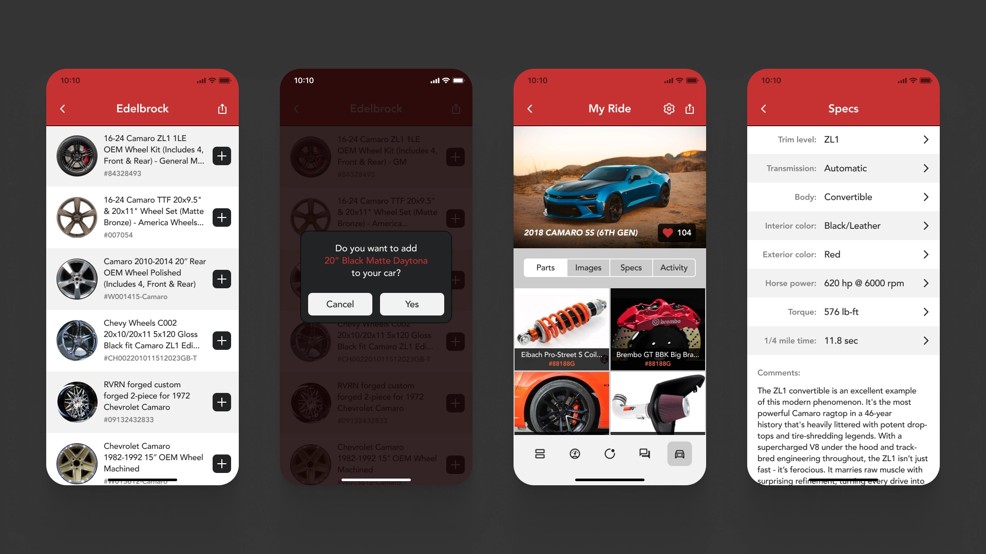
The vision was a platform where users could connect, share custom mods, troubleshoot issues, and showcase car upgrades. The app needed to be visually distinct, easy to navigate, and capable of letting users add or remove parts or modifications to their vehicles seamlessly.
Our approach.
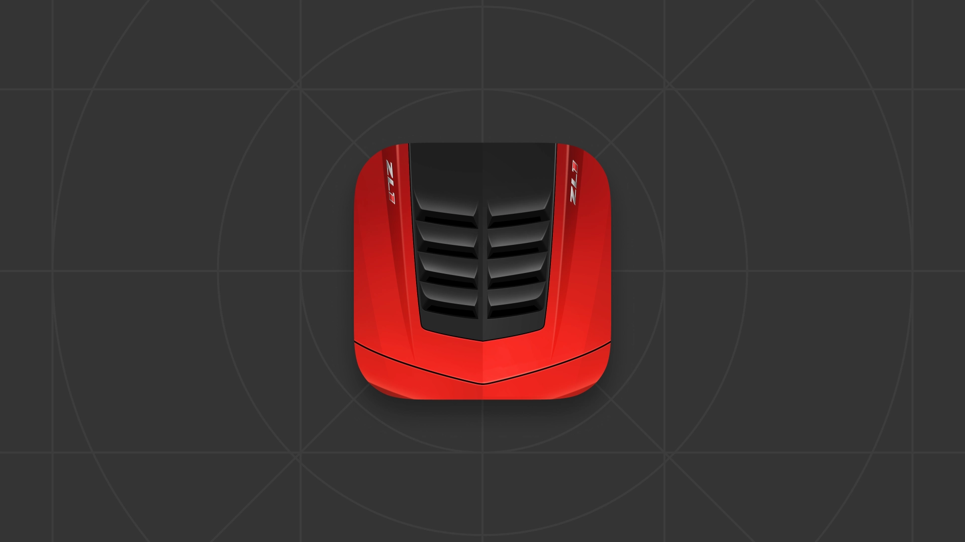
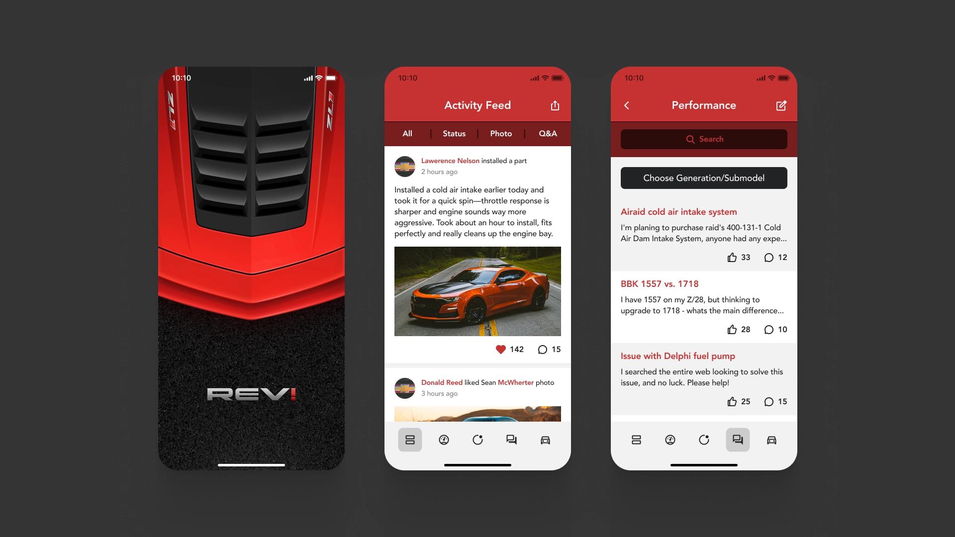
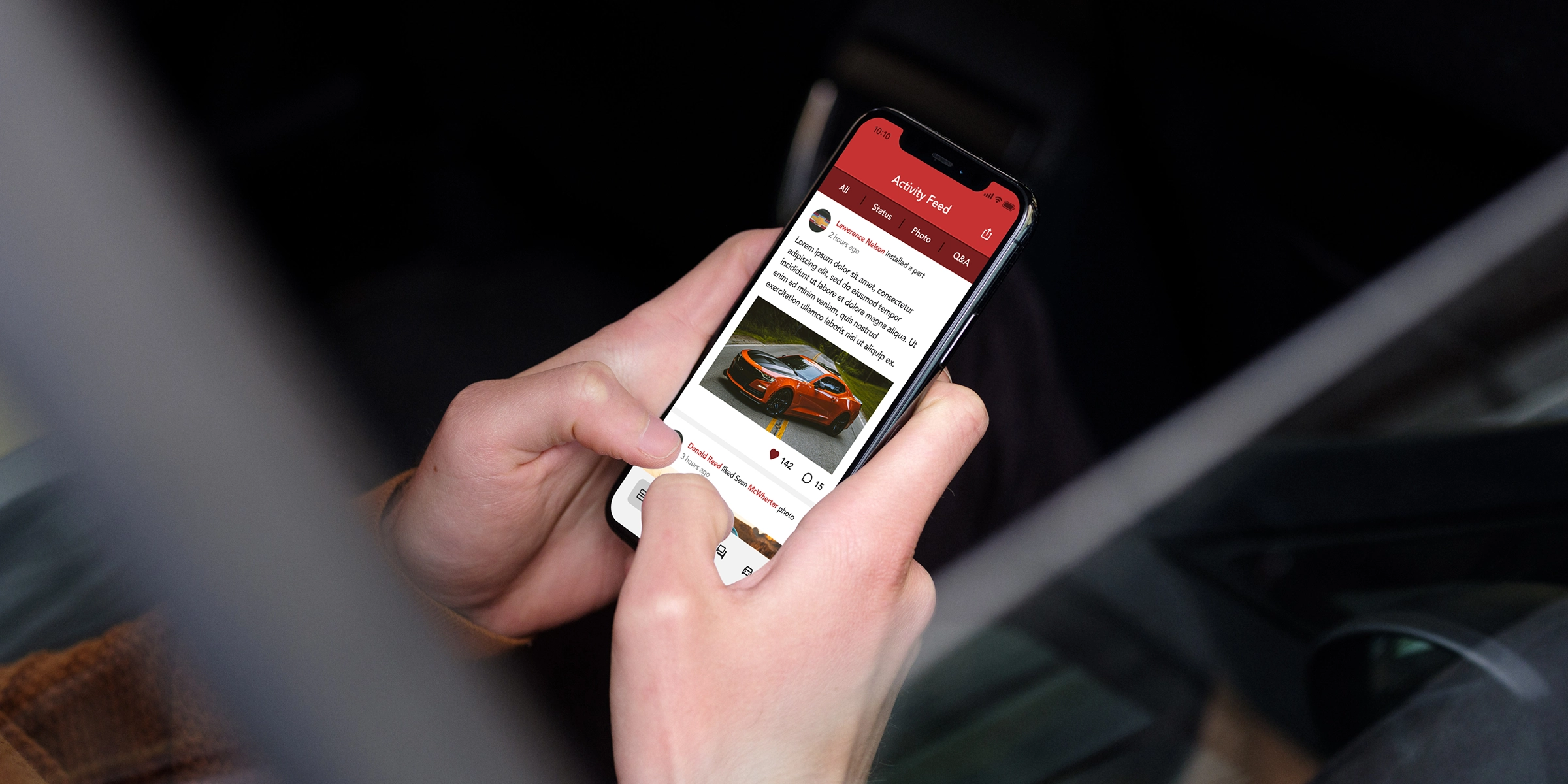
We focused on creating a user experience that was simple and intuitive, with the community and social sharing at its core. That’s why we designed the feed as the home screen—allowing users to instantly like, comment on, and share posts from other Camaro owners. To give the app its own visual identity, we proposed a bold vermilion red theme paired with clean, contrasting UI elements. To push it further and make the app unmistakably unique, we designed a custom app icon and splash screen that captured the high-performance spirit of the Camaro.
The outcome.
The vibrant vermilion red established a strong, memorable brand presence. For content-heavy views, we introduced a striped UI layout to enhance contrast and readability. The standout feature was the custom icon—a bold graphic inspired by a vented hood of a bright red Camaro, echoed on the splash screen as well. In a time when skeuomorphic design and eye-candy interfaces dominated the App Store, this distinctive visual style helped the app cut through the noise and grab attention.