A student portal revision.
The brief.
As part of its broader modernization efforts, NOLS intends to rebuild its existing student portal and create an admissions portal from a subset of functions currently available in their Nexus application. NOLS intend to rebuild the student portal with many of the same functions it has today, with the user experience of the current student portal to be re-envisioned. The new design should focus on a seamless experience with the course finder website, shared authentication with the course finder via WordPress authentication, and usability improvements to make navigation and finding pertinent information easier.
Our approach.
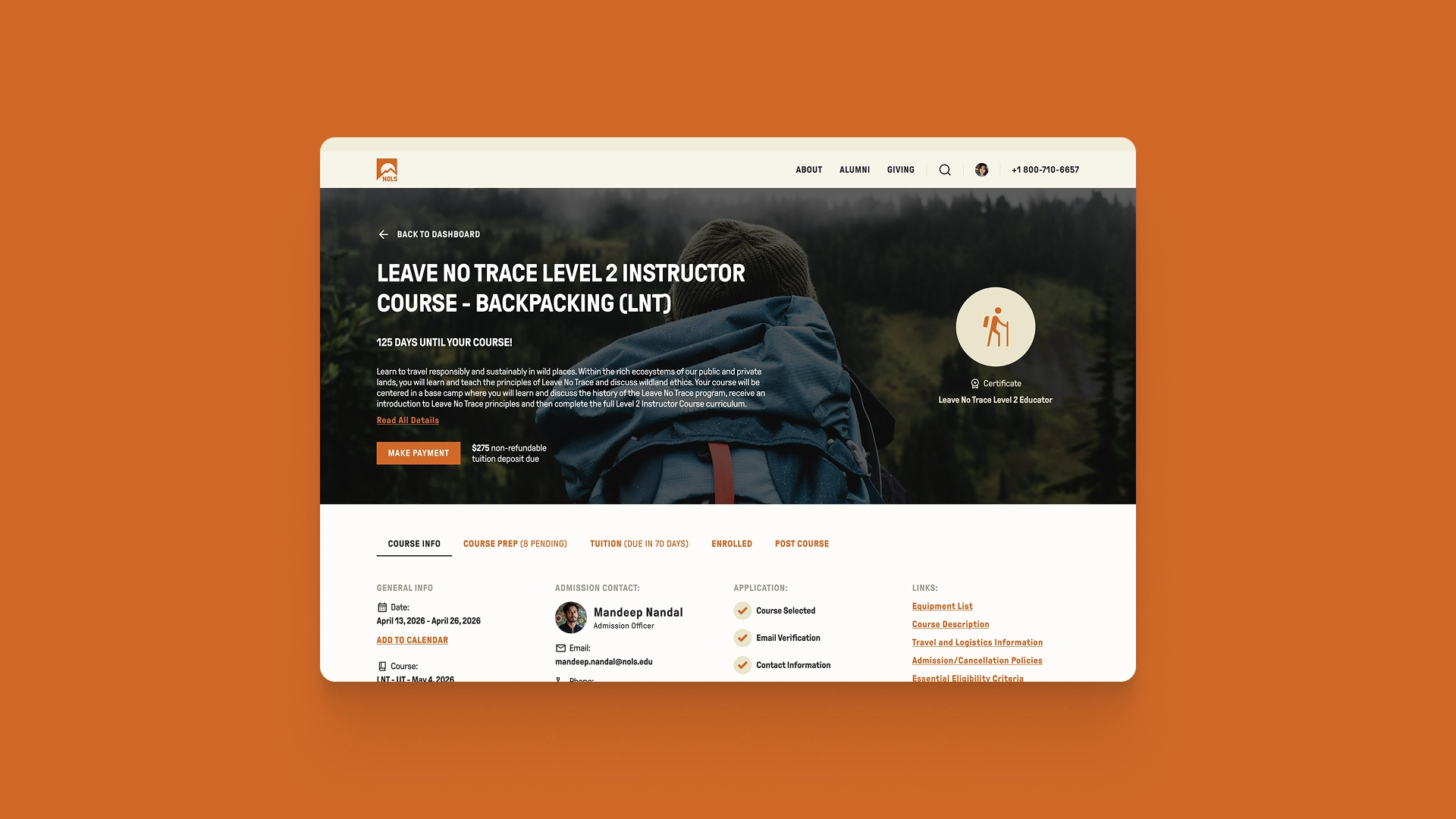
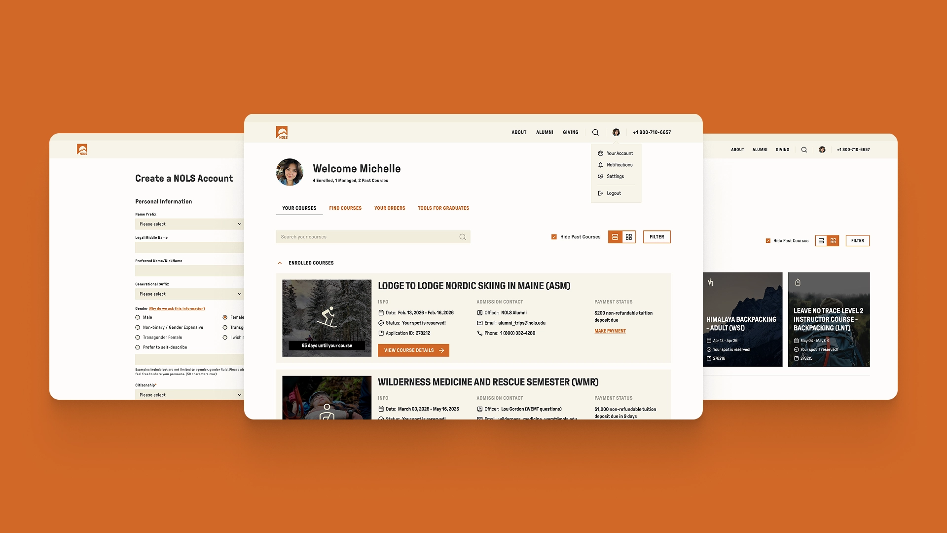
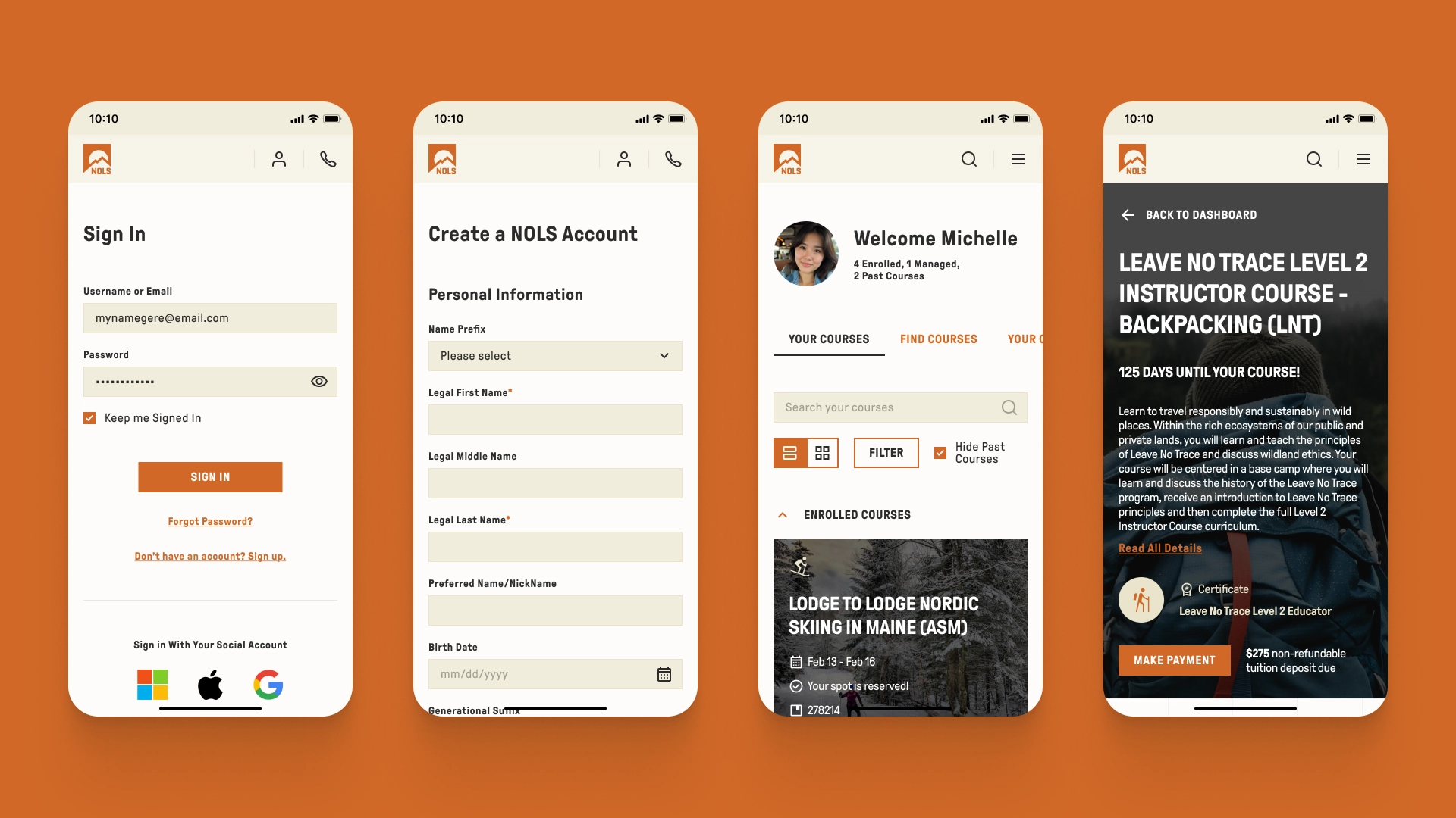
Our directive was to preserve the existing branding, design, and overall look while improving the UX wherever possible. We recommended simplifying and streamlining access to the student portal, introducing a consolidated dashboard, and creating dedicated course pages instead of maintaining separate dashboards for each course. Each course page is designed to be visually appealing and to present all relevant information clearly on a single, unified page.
The opportunity is huge for Ascendum. We've been working diligently on the technical side with NOLS for years, but the new websites were an opportunity to also show our strength in design. Both NOLS' IT and Marketing leads were delighted with the vision and speed of delivery this POC provided. It gave them early confidence that we can support every facet of the project's delivery.
The outcome.
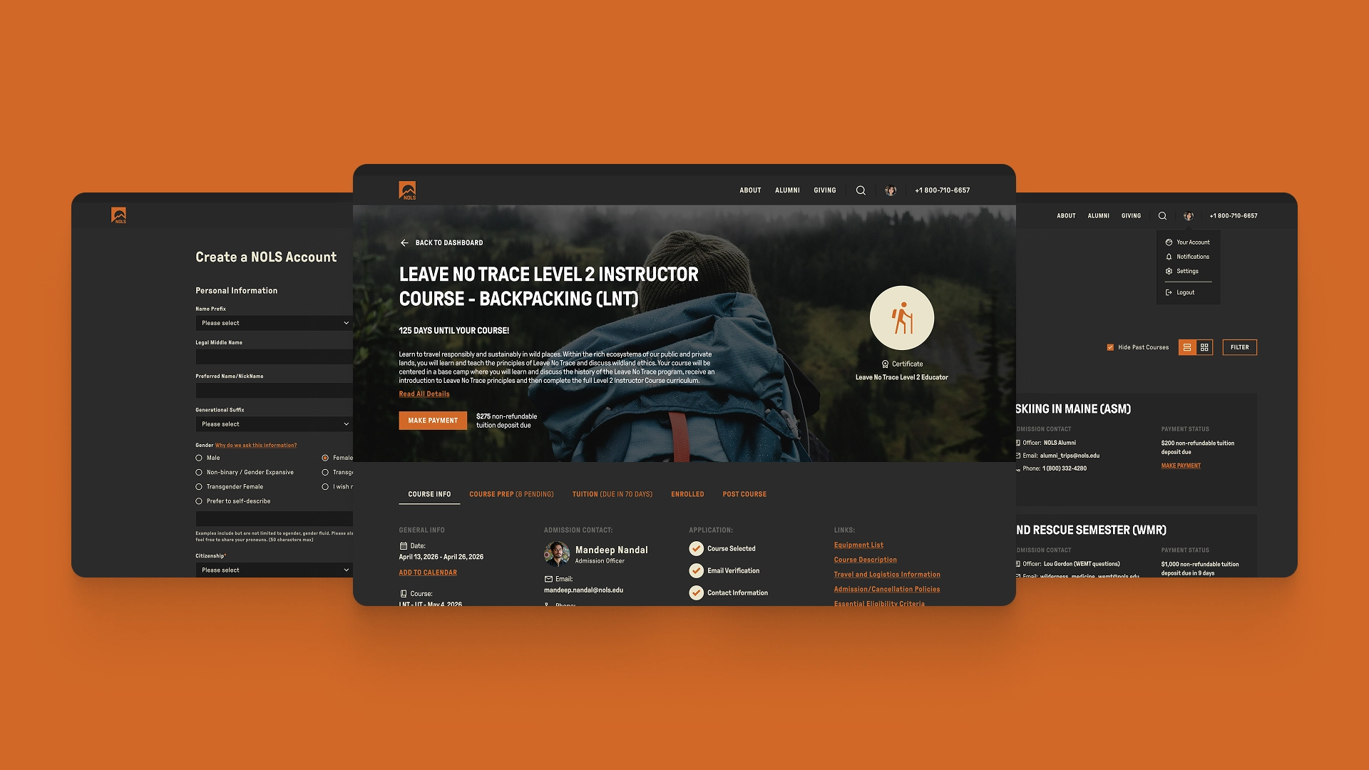
The end result was a cleaner, more visually refined dashboard with unnecessary clutter removed. Secondary information was moved into the standard user dropdown, allowing the interface to focus clearly on courses. Compared to the previous experience, there is now a clear distinction between courses a user is enrolled in and those they manage on behalf of others.Each course’s detailed page exposes all essential information upfront, with payment options accessible in a single click. To further enhance the experience, we introduced a dark mode which aligns naturally with NOLS’ brand colors and was the preferred option among the project team.