A network of networks.
The brief.
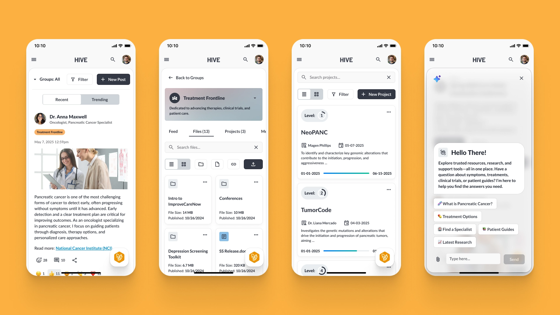
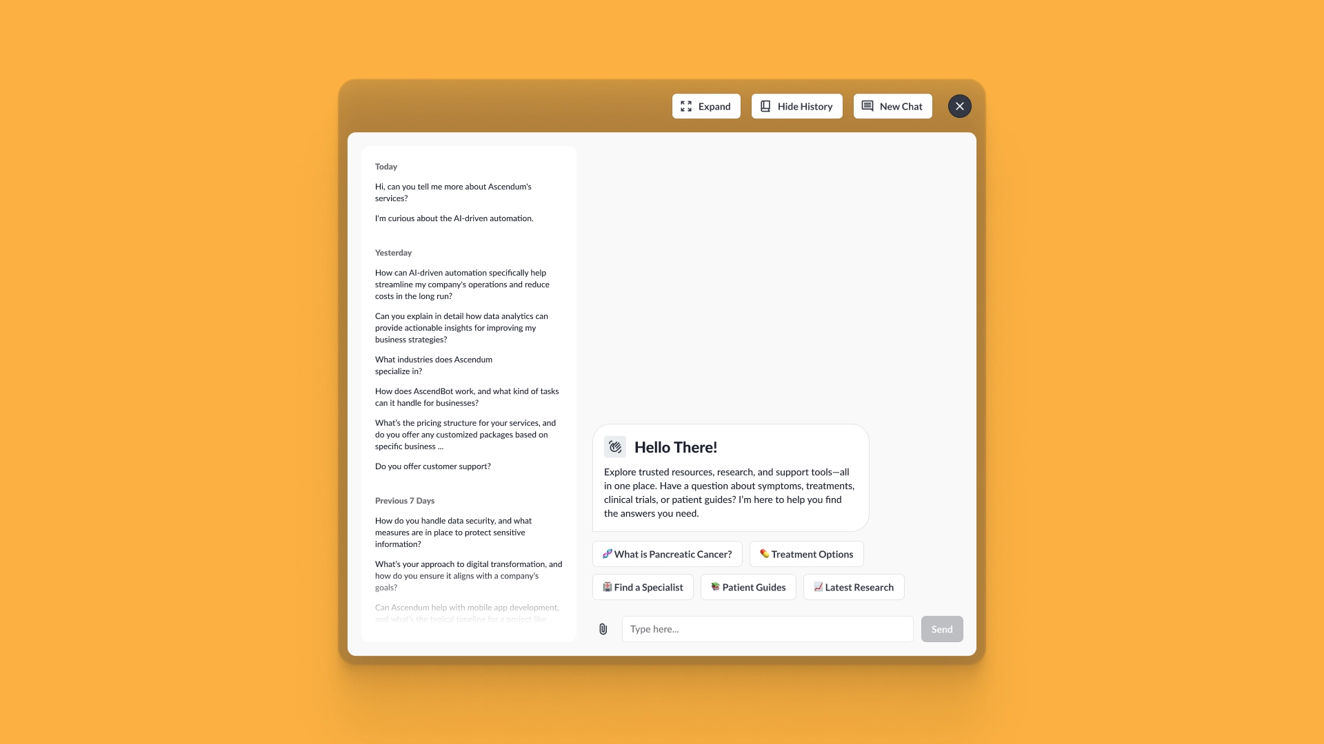
Hive is a platform that acts as an operating system for disease-specific pediatric networks. Each network brings caregivers, clinicians, and researchers together to share data, collaborate, and improve outcomes. Because members are part-time and scattered across tools, the task was to consolidate collaboration, documentation, and outcome data into a single system and improve both UI and UX.
Our approach.
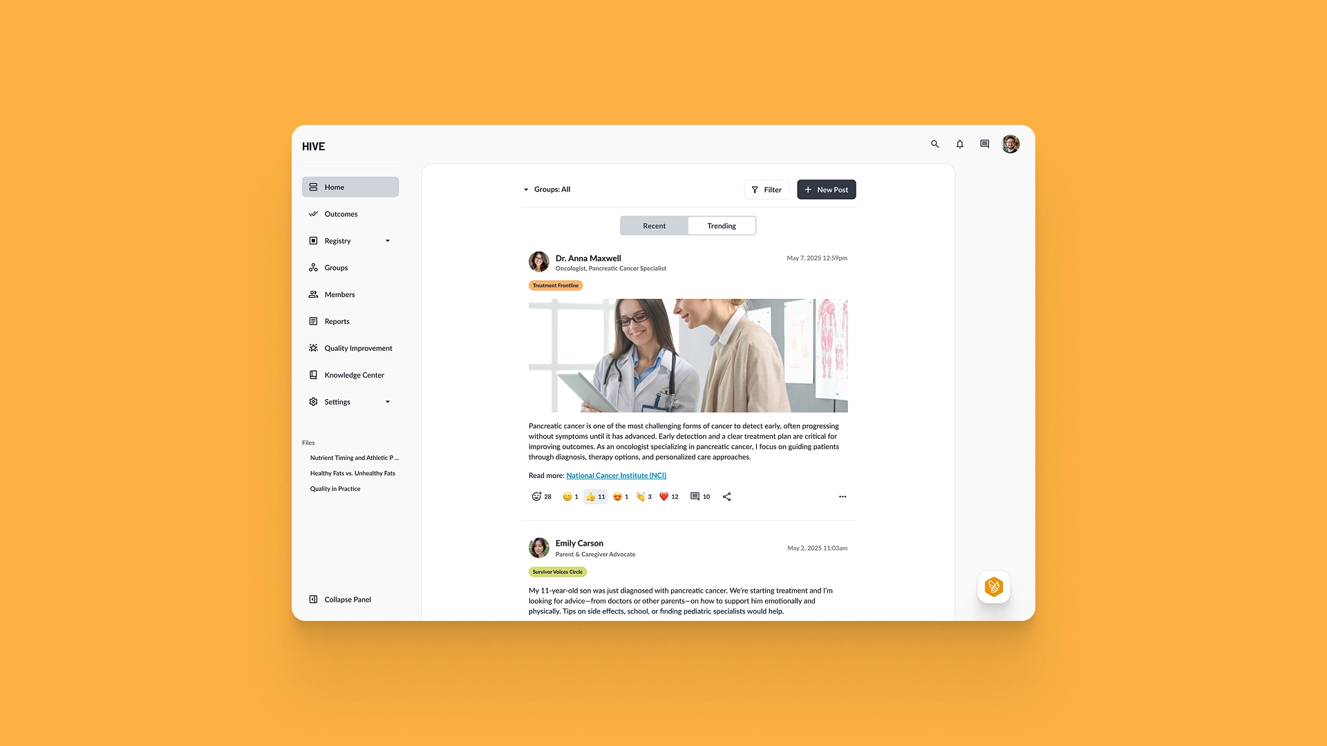
The platform was difficult to navigate due to a fragmented and confusing structure, with related modules scattered and unclear labels that left users unsure of their purpose. Navigation relied on linear top links, which limited future expansion. On top of that, the Home screen was cluttered, making it hard for users to focus on the content that mattered most.
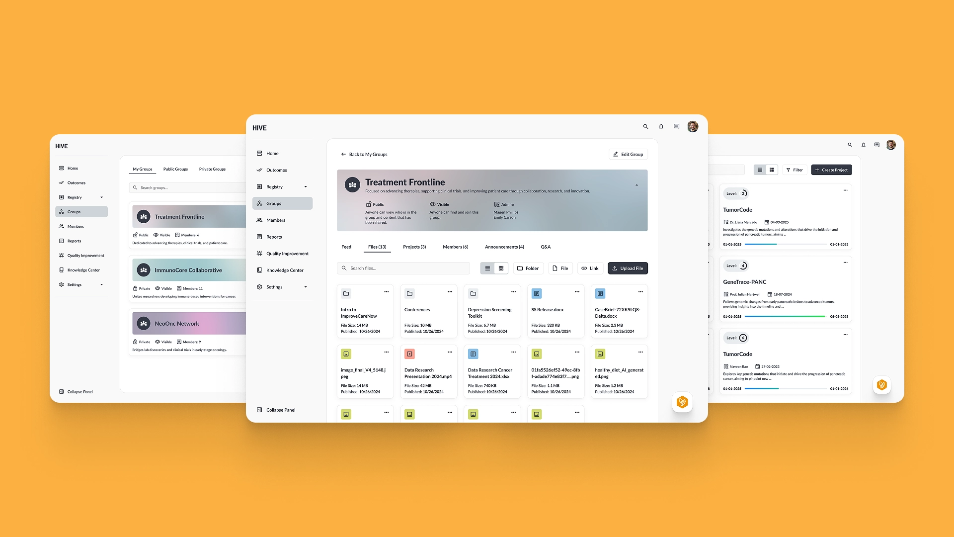
Restructure and navigation
Users can better navigate and focus on what is important to them based on their role.
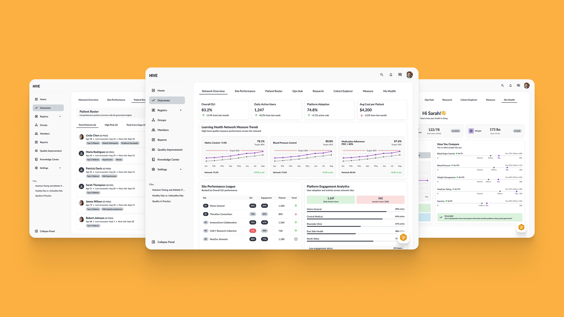
Dedicated outcomes dashboard
Outcomes were transformed into a dedicated dashboard to clearly surface analytics and key data.
Clean new UI
The redesign established a design language focused on clarity and was created with potential white-labeling in mind.
Working with the Ascendum team on the Hive redesign was a great experience. Their creative vision and technical skills helped us modernize our SaaS interface and upgrade our code libraries, and their collaborative approach made the entire process smooth and efficient. I look forward to our next project together.
The outcome.
We reorganized to create a clearer, more logical structure - related modules were consolidated, and unclear labels were renamed to better reflect their purpose. The Groups functionality and documentation were restructured into more defined sections - they each have a dedicated spot and purpose. Navigation shifted from linear top links to a persistent sidebar to make navigation more intuitive and easier to expand over time. The Home screen was decluttered, giving users a cleaner view and clearer focus on what matters - content from actual people.